Showcasing Our Content & Improving the Reading Experience

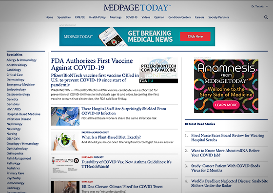
MedPage Today features medical news for physicians and other healthcare providers. The editorial team felt the homepage needed an updated look. After some generative research, we found that our readers felt the homepage was too clutter and text-heavy. In addition, the way the content was organized did not make sense to them.

With this user feedback in mind, I designed the more organized homepage that incorporated more image . The layout now has a focal point for users with a large featured article at the top of the page. The page was purposely built in sections that could be easily rearranged to A/B test the order and feature more popular sections higher on the page.

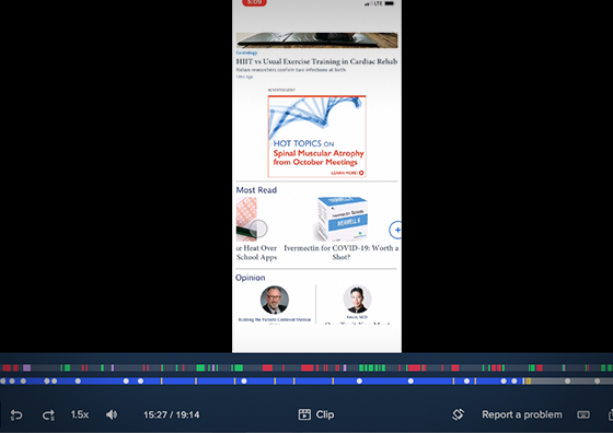
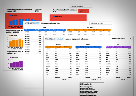
Several different methods of research were used in order to evaluate the changes to the site. I conducted usability tests on prototypes of the homepage and showed participants different versions to understand which layouts they liked best and why. We monitored analytics to determine what type of content was most appealing to our readers. We also A/B tested some new components to see if they garnered more engagement than previous versions.

One of the business’s key objectives was 2.0 pages per session. With the homepage redesign, verified healthcare providers were viewing 2.12 pages per session when they visited the homepage. Bounce rate also decreased by 14%. We’re continuing to iterate on the design to feature new content and meet the needs of our readers.