Redesigning and optimizing a cart experience

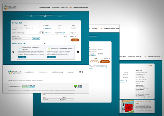
The e-commerce cart and checkout experience had not been updated in 7 years. While the cart needed to be moved to a new platform, there were other pain points and stakeholder goals that needed to be addressed. With the previous experience, both the cart review and billing information were all on one long page, overwhelming users. There was little visibility of system status, which was often led to users wondering if their orders had gone through.

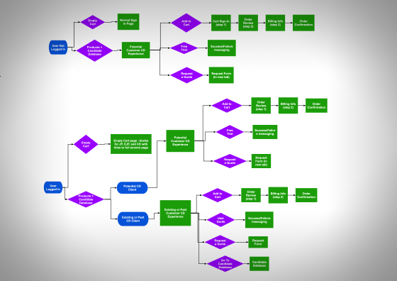
We designed the new cart experience that allowed users to better focus on reviewing their cart and entering their information. We also added upsell cards to offer users discounts for purchasing additional products. By pacing the experience, our B2B team is now able to send reminder emails when users abandon their carts. We also added a separate confirmation page with helpful resources.

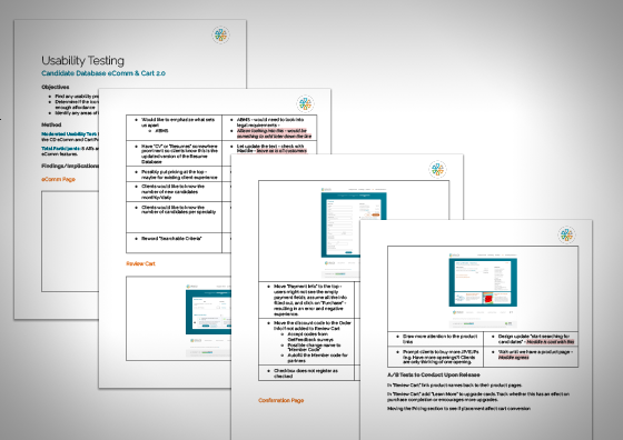
To ensure the changes would meet user needs, I built a prototype of the new experience and tested it with 10 participants from our target audience. The participants responded positively to the overall experience, and the vast majority were comfortable and confident in using the e-commerce experience. Participants did run into some issues with the "edit cart" experience, which we decided to address before the release.

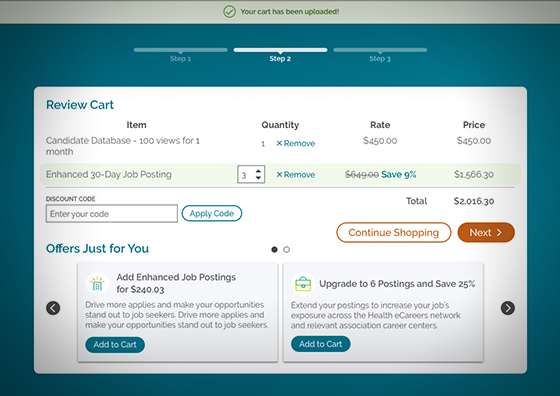
In user testing, some participants were unsure that the edits made to their cart were going through. To address this, pop-up notifications were added to the experience. A green “success” highlight was also added to the item line that was edited.
The cart experience now consistently receives positive user feedback. Our cart completions are around 62%. E-commerce makes up an average of 45% of the business’s transactional sales.