Redesigning the info card to optimize the watching and recording TV

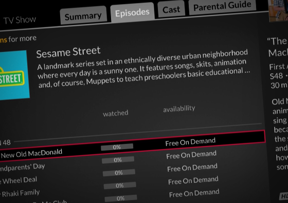
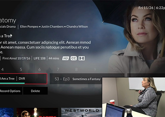
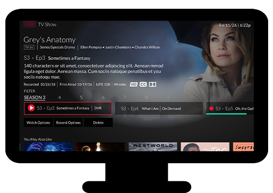
The info card is one of the most viewed and most used areas of the DISH UI. However, the information was often inconsistent and excessive. My team was tasked with redesigning the info card so users could easily find content or set recordings.

Our first objective was to determine what information was important to our users. We gather analytics as well as conducted user interviews. We quickly found that this varied based on the type of content (i.e. movies versus TV shows versus sports). Based on user feedback, we found that our users like that we have more information than competitor services were displaying. However, it could be cumbersome to find the information on our system.

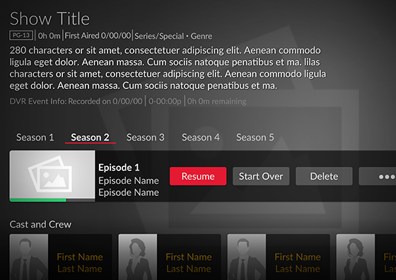
Once we identified the users’ goals, we began constructing the information architecture for the different types of content. We then began wireframing and building the information hierarchy. Based on these wireframes, we built prototypes and begun user testing.

We continue to iterate and test our designs. We’ve eliminated user pain points by simplifying the information displayed and improved navigation. With the new designs, users have very low error rates and are reporting higher SUS scores.